Designing an Ergonomic Ticket Dispensing Kiosk for Indian Metro Stations.

https://doi.org/10.34104/ajeit.021.0970118
https://doi.org/10.34104/ajeit.021.0970118
10.4103/ijo.IJO_2804_21
10.4103/ijo.IJO_2804_21

DMRC Report
DMRC Report

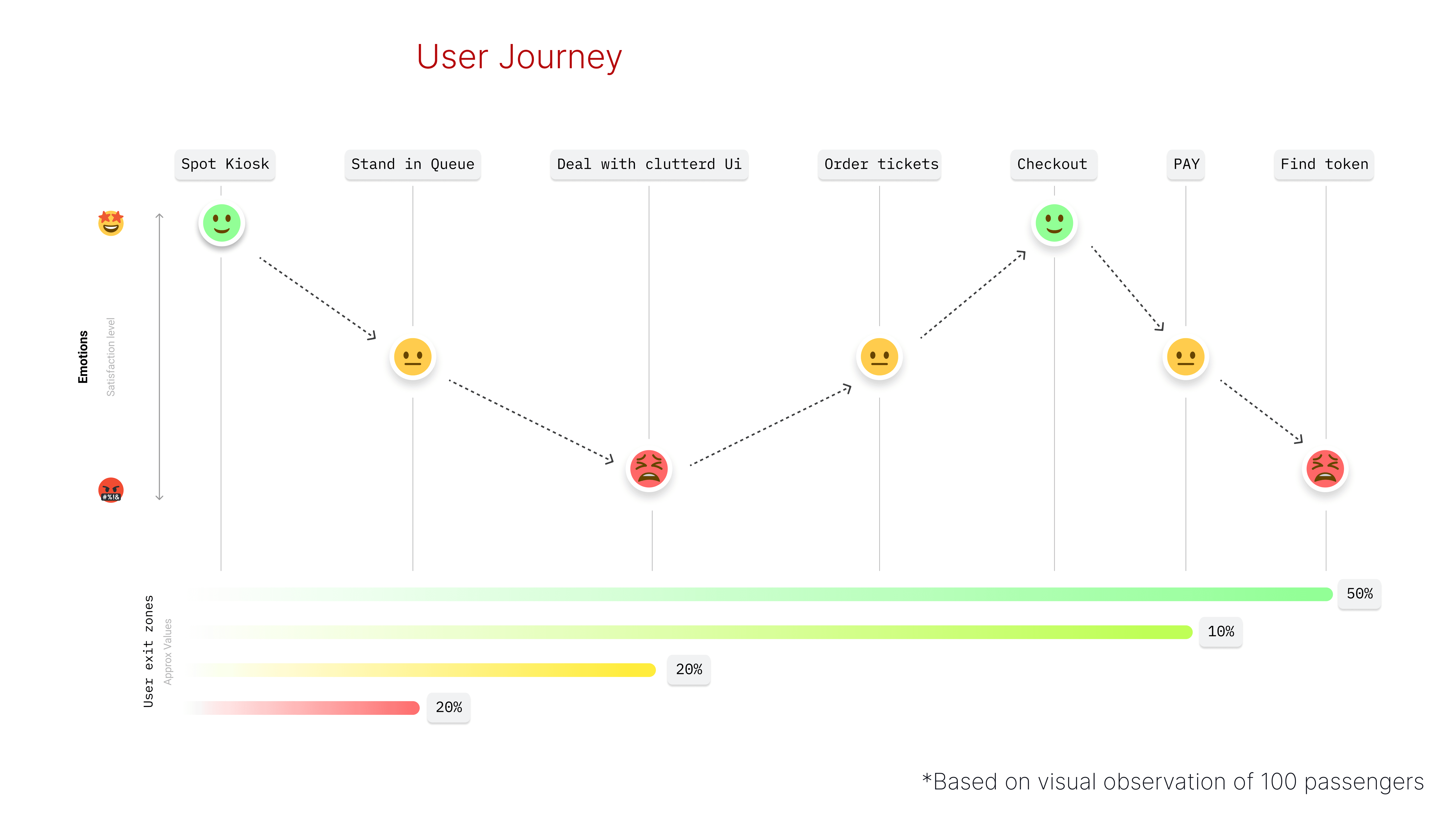
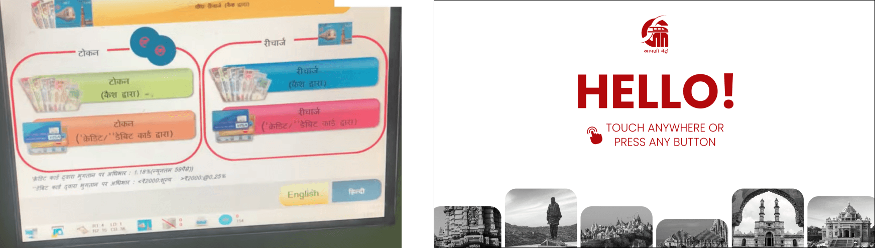
The Problem?


These are the machines

This is the interface
Project Objective
Project Objective
Redesigning Metro Station Token Dispensing Kiosk User Interface for Enhanced Accessibility and User Experience.
Redesigning Metro Station Token Dispensing Kiosk User Interface for Enhanced Accessibility and User Experience.
The primary objective of this project is to improve the user interface of metro station token dispensing kiosks, with a specific focus on improving accessibility, cognitive ergonomics, and overall user experience. The existing kiosk interface is identified as cluttered and challenging to use, necessitating a strategic redesign to address these issues and make the system universally accessible.
The primary objective of this project is to improve the user interface of metro station token dispensing kiosks, with a specific focus on improving accessibility, cognitive ergonomics, and overall user experience. The existing kiosk interface is identified as cluttered and challenging to use, necessitating a strategic redesign to address these issues and make the system universally accessible.
User Research
User Research
60+
Survey respondents
10+
Personal Interviews
100+
Users Observed
Accessibility and Adaptibility
Accessibility and Adaptibility
Contrast: The text and button colors must be chosen with the highest possible contrast, making it legible for people with visual disabilities. The contrast level must pass WCAG AAA.
Buttons: All buttons and touch targets must be large enough and in reach of the user. It helps people with motor disabilities and users in general hit targets accurately and consistently.
Voices: By default there must be a voice narrator assistant to help navigate people with visual disabilities.
Limited choice: There must be limited choice at each stage and not bombard the consumer with dilemmas thus leading to confusion.
A Visual approach: Every decision screen must be supported by clear visuals that can stand alone without the need of text, thus helping people not versed with the language.

WCAG COMPLIANCE
WCAG COMPLIANCE
WCAG 2.0 refers to Web Content Accessibility Guidelines, which are published by the World Wide Web Consortium’s (W3C) Web Accessibility Initiative (WAI). WCAG provides recommendations for making digital content more accessible. Within these guidelines are three levels of conformance, those being A, AA, and AAA.
WCAG 2.0 refers to Web Content Accessibility Guidelines, which are published by the World Wide Web Consortium’s (W3C) Web Accessibility Initiative (WAI). WCAG provides recommendations for making digital content more accessible. Within these guidelines are three levels of conformance, those being A, AA, and AAA.
WCAG COMPLIANCE level aaa (optimum)
WCAG COMPLIANCE level aaa (optimum)
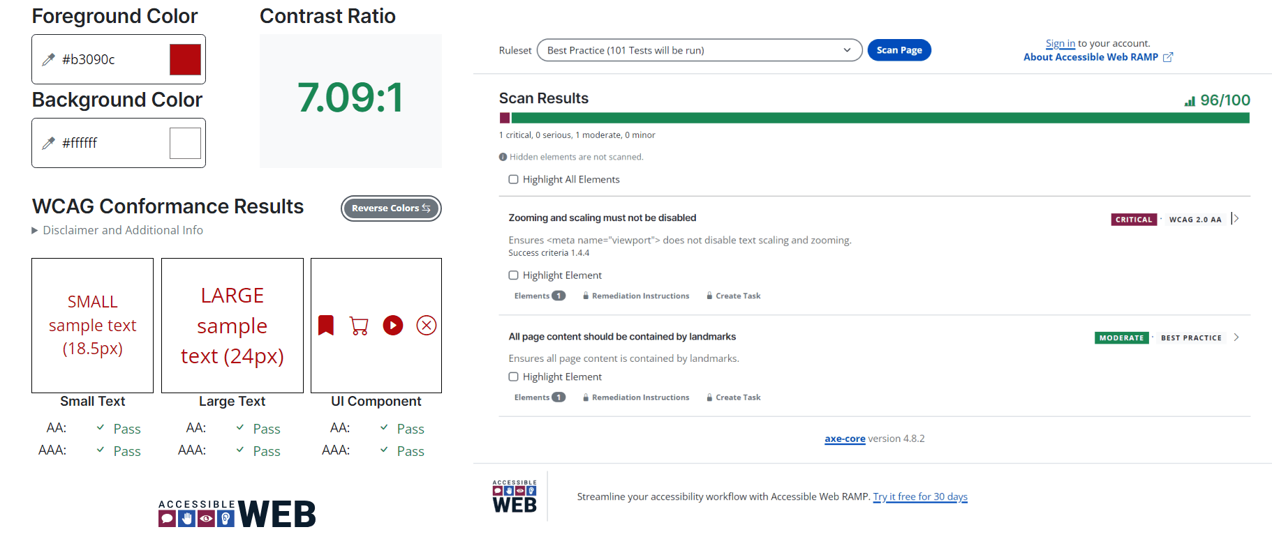
WCAG Level AAA requires a contrast ratio of at least 7:1 for normal text and 4.5:1 for large text. Large text is defined as 14 point (typically 18.66px) and bold or larger, or 18 point (typically 24px) or larger.
Use very dark color text on a very light background and vice versa
WCAG Level AAA requires a contrast ratio of at least 7:1 for normal text and 4.5:1 for large text. Large text is defined as 14 point (typically 18.66px) and bold or larger, or 18 point (typically 24px) or larger.
Use very dark color text on a very light background and vice versa

Assistive Technology for Visually Impaired
Assistive Technology for Visually Impaired
As much as blind people need specialized technology, building accessibility into mainstream products may be an even bigger need, say advocates such as Mark Riccobono, president of the National Federation of the Blind.
He points to the iPhone, which had accessibility built into it from the beginning.
“I can go down to the Apple store and pay the same price and triple-click the home button and I have VoiceOver,” says Mr. Riccobono, referring to a feature where the phone will describe aloud what is happening on the screen. “That’s built in, it’s great, it doesn’t cost a penny extra.”

European Accessibility Act (EAA)
European Accessibility Act (EAA)
The European Accessibility Act is a landmark legislation enacted by the European Union (EU) in December 2020. Derived from the UN Convention on the Rights of Persons with Disabilities, EAA is a progressive Act to answer the problems of marginalization.
It is a set of guidelines that sets the requirements for the accessibility of products and services in the EU, including websites, mobile applications, and other digital products. The goal of the act is to ensure that users with disabilities can fully tap digital resources and have access to the same products and services as everyone else.
The act mandates that people with disabilities are able to access products and services covered by this law proportionately to the effort and cost involved. It is applicable to all the EU member states and covers products and services such as telecommunication and multimedia equipment, banking and payment services, e-books and e-papers, e-commerce, and more. The act can be considered a crucial step in promoting digital accessibility and inclusiveness in the EU.
Inclusiveness: Creating UI/UX designs by focusing on accessibility helps to reach a wider audience. This ensures that the design provides equal access to information for all users.
User-experience: When a design is accessible it means the overall user experience is improved as it is easier for all users to navigate and interact with digital products.
Legal obligation: Failing to comply with the regulations of the act can result in legal and financial consequences, so it is important for UX/UI designers to ensure that the product is compliant.
Business benefits: Businesses prioritizing accessibility benefit from improved customer satisfaction, better search engine optimization, and a reputation for being socially responsible.
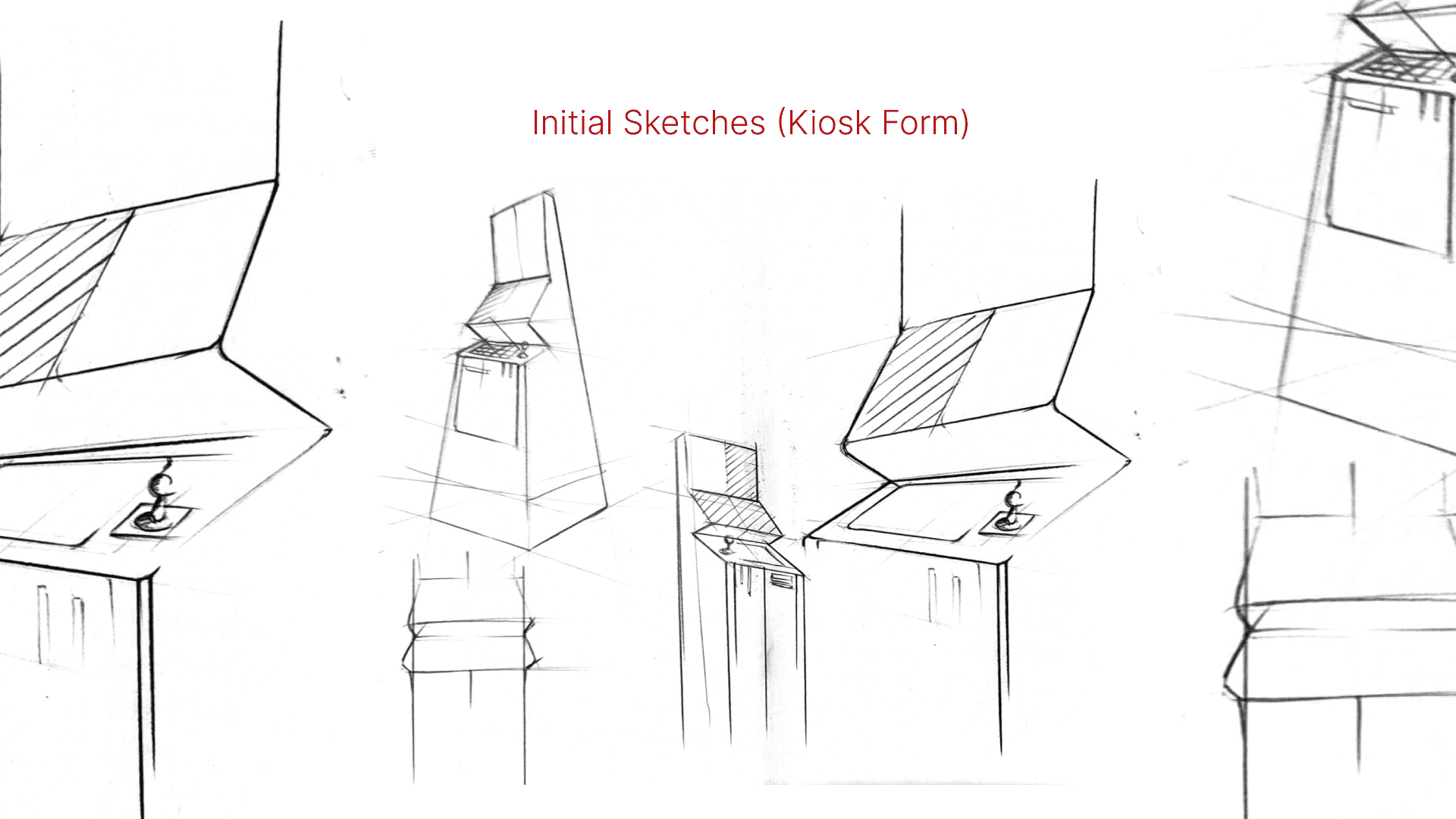
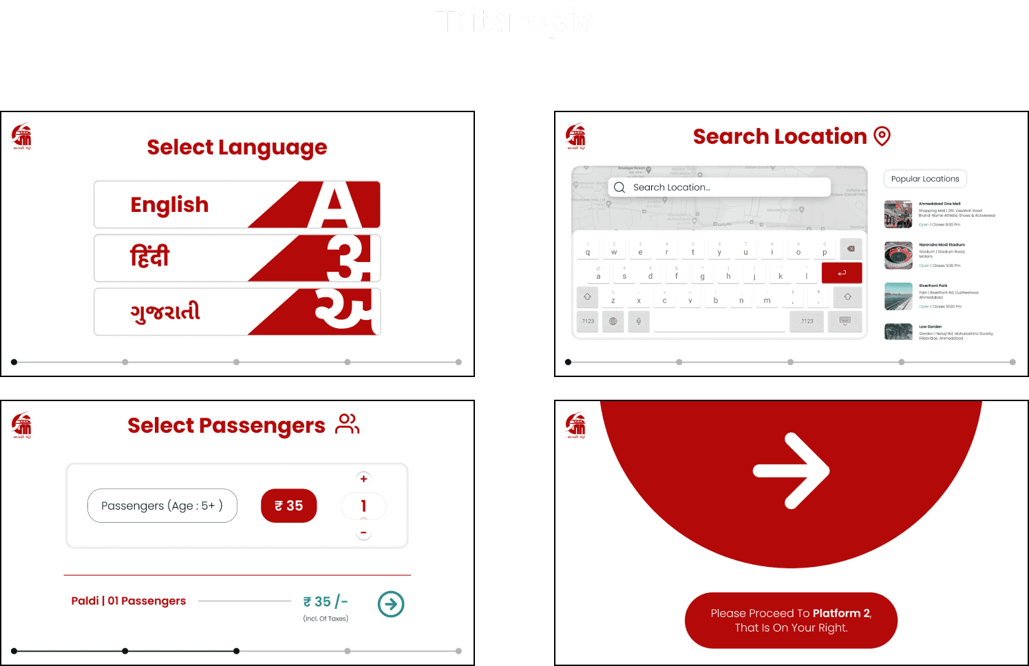
The Form.


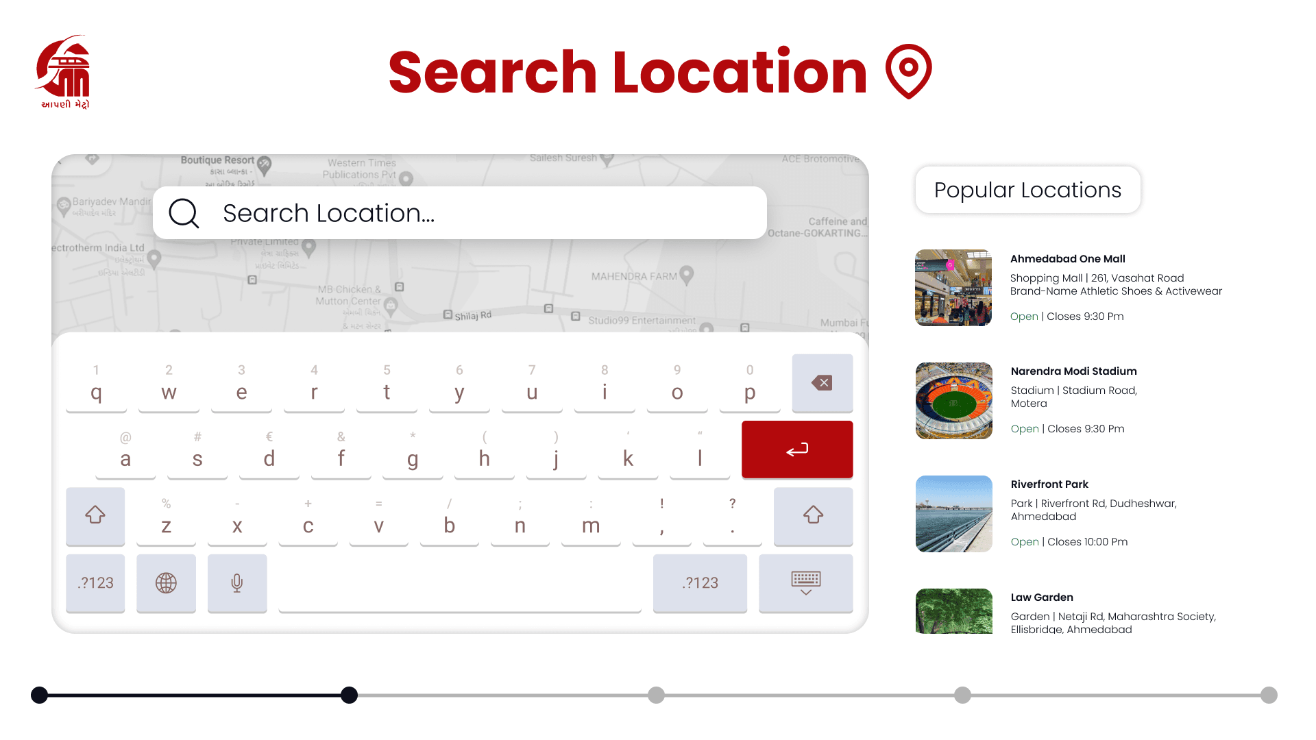
The Interface.


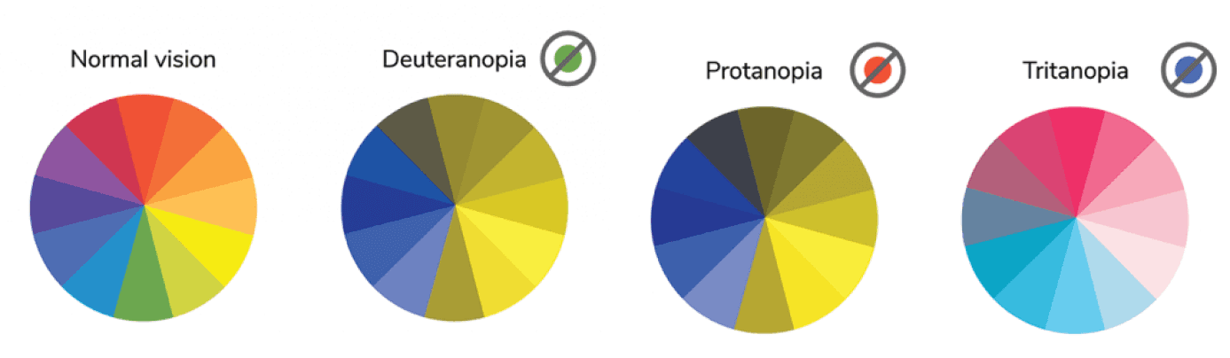
Color Blindness Accessibility
Color Blindness Accessibility
After going through a lot of resources, The color combination and the contrast ratio were carefully chosen to ensure that the interface is accessible to people with all kind of color blindness.
After going through a lot of resources, The color combination and the contrast ratio were carefully chosen to ensure that the interface is accessible to people with all kind of color blindness.

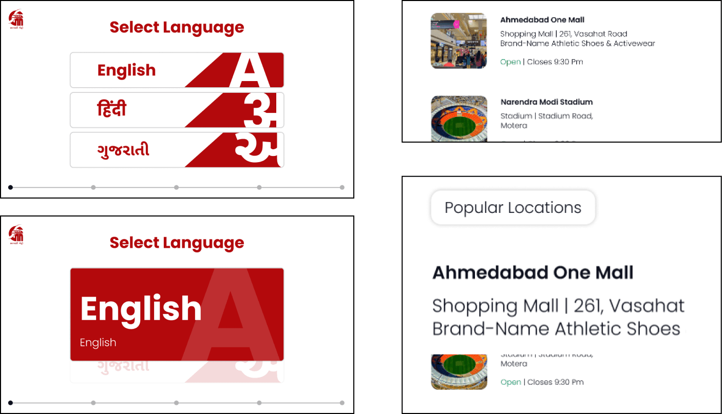
Zoom Assist
Zoom Assist
The interface has the ability to be magnified when someone holds a particular element to ensure maximum readbility.
The interface has the ability to be magnified when someone holds a particular element to ensure maximum readbility.
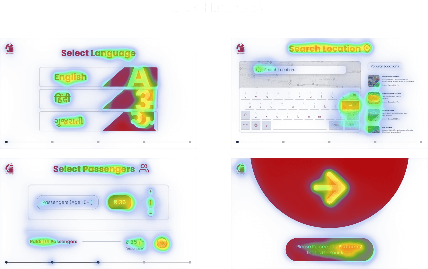
WCAG Guidelines test
Visual Disability assisting alternate interface
Visual Disability assisting alternate interface
Trouble arrived when it came to figuring things for people with complete visual impairment. Instead of the traditional braille setup, I came up with completely different interface that comprises of an intuitive joystick and narration assist. It has proven to be more fast, easy and efficient than handling a braille keyboard.
Trouble arrived when it came to figuring things for people with complete visual impairment. Instead of the traditional braille setup, I came up with completely different interface that comprises of an intuitive joystick and narration assist. It has proven to be more fast, easy and efficient than handling a braille keyboard.
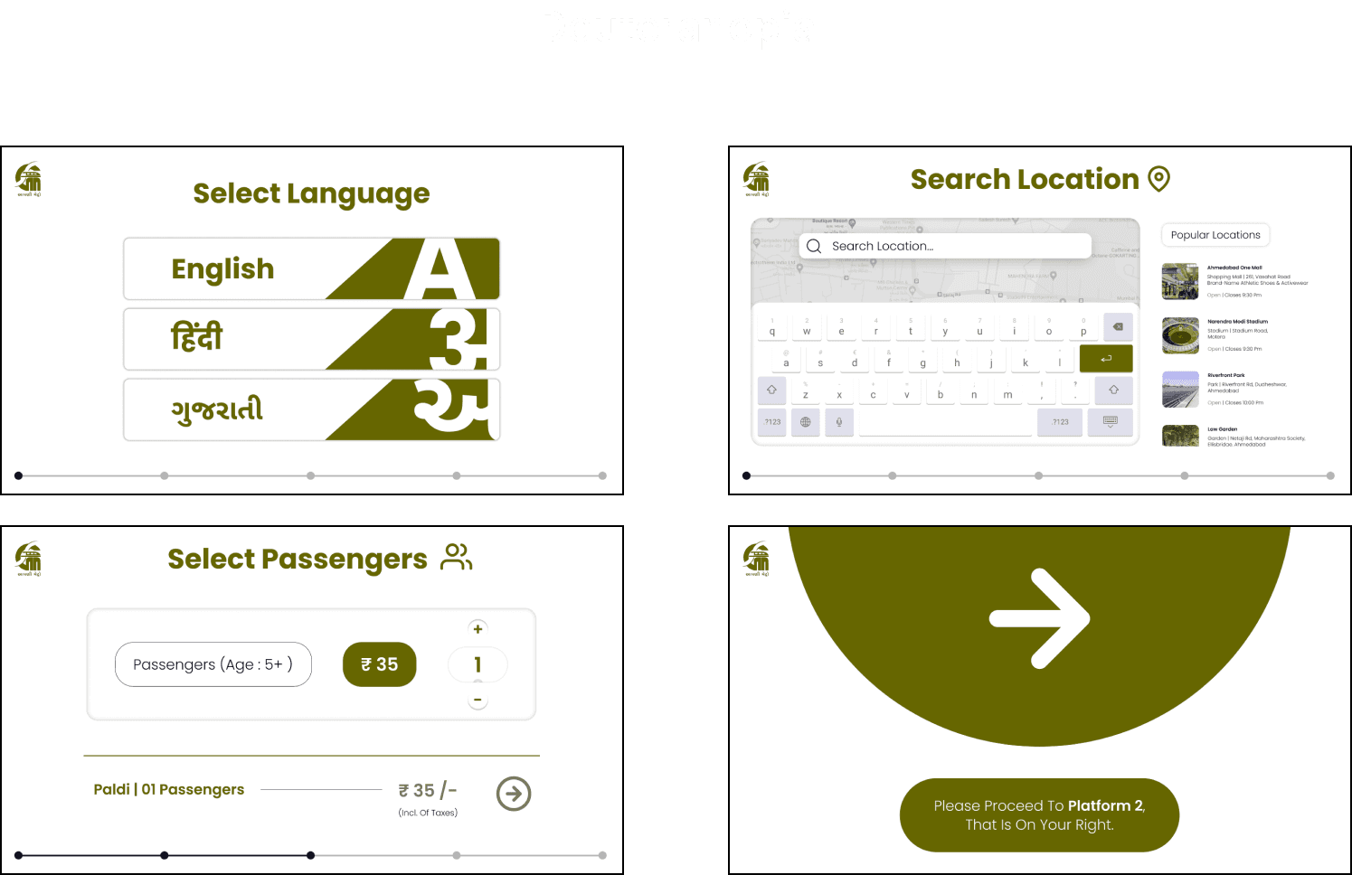
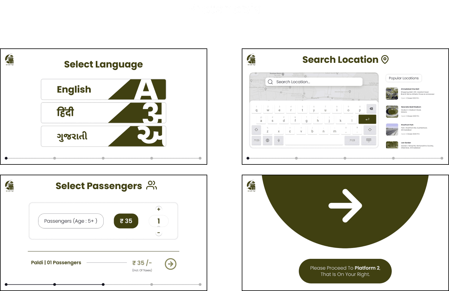
Before and After

Oh also,
You just scrolled the
length of 22 cushions!
Oh also,
You just scrolled the
length of 22 cushions!
That's a lot of sitting, so here's your reminder to stand up and take a walk. keep that blood flowing!
